case study: the screen, animation & branding
Welcome to our case study for The Screen cinema, an amazing new cinema that’s just opened in Windsor, with exciting dreams and ideas for how they want to build their brand. Nestled in the iconic building, The Old Court art centre (previously The Fire Station), the cinema is a perfect place to meet up with friends or for work meetings and have a drink, watch a movie or see a show or live music on one of the art spaces.
what was the brief?
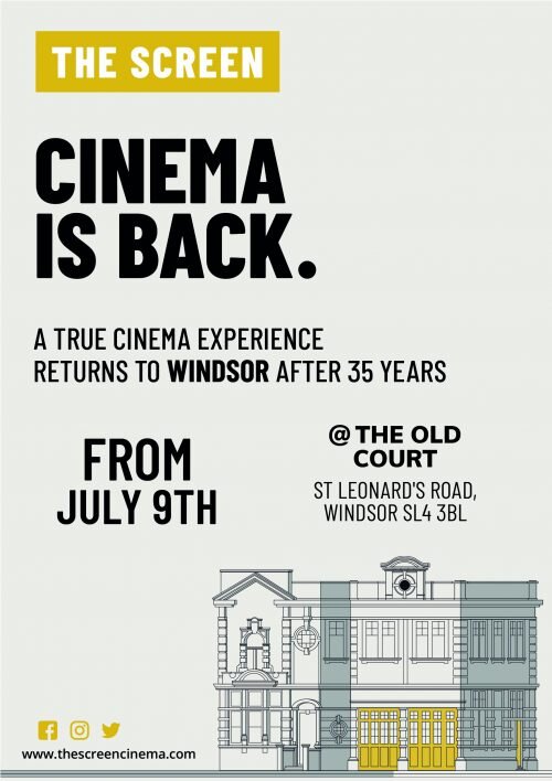
We were approached to do The Screen’s branding, POS, corporate intro animation and web design with a brief to create a concept and design from scratch. Windsor has not had a cinema in 35 years, so when The Screen wanted our help to launch their brand and venue we used the campaign line: Cinema is back!
In short, we were tasked to fully create their brand image, an animation that captivates, a website design that looks sleek, modern and simple to navigate, as well as their social media marketing – planning and implementation.
So, after our robust briefing and re-briefing process, we distilled a concept for our client, embracing their vision and transformed an idea, into digital and advertising life, with a look which is both clean and modern and a little bit retro.
what did salamandra.uk create?
At first, we illustrated a fresh stand-out modern logo, something that was simple, eye-catching and easy to remember and relatable to consumers as well as using stylised architectural type drawings of the iconic building as part of their branding.
After that, we began creating their brand guidelines. A comprehensive, detailed and informative guide outlining all the areas around their logo and brand including font, image usage, logo usage etc., for future suppliers to refer to and benchmark their work accurately to this newly created brand.
Soon after we designed and printed their marketing POS material including flyers, leaflets, posters, vinyl banners, stickers and magnets.
We also re-purposed these design assets for the client online (as their social media managers) to successfully generate awareness of their launch, reaching 21,500 people.
For their website assets and social media, we created icons for their About Page, and for their social media launch campaign. As you can see everything created falls within the brand guidelines which is essential for producing a consistent brand image.
The proposal for creating an animation for the big screen certainly brought a smile to our faces here in the studio. As an animation and creative studio, whenever we’re tasked with bringing imagery and brand work to animated life, it’s more like fun times than work to us!
The animation’s purpose was to brand the venue by playing it at the start of every movie, providing a branded but unique local homely experience. The design choice and aesthetic would fall under the retro genre and a homage to cinematography’s past; something we hope the local Windsor population will appreciate.
what was our favourite part?
The animation was definitely the best part of this project as bringing assets and brand image to life is something we love creating and sharing because we know film/animation stays in the audience’s long term memory thereby keeping The Screen in Windsor top of mind for everyone.


